Pragmatic Institute‘s data podcast covers emerging and relevant topics in data science, data analytics, data engineering and pretty much all things data. They have some cool episodes with fellow book authors Charles Wheelan Alberto Cairo and Cole-Nussbaumer-Knaflic as well as data scientits from GoDaddy or Netflix.
“We also wanted to use the textbook to talk about important social issues, like, why do men make more than women? And so, one case study is about understanding the gender gap in the US and why is there a 15, 20% difference in earnings.” - Gábor Békés
In this episode of Data Chats, Chris Richardson interviews Gábor Békés. They discuss:
I talk about
Process of producing the code that is on the website.
Some other bits
What a student who has read this book will be able to do this after reading the book: 95% of what an analyst needs (as pointed out by Joshua Angrist)
MS in Business Analytics, MS Applied Data Science – a variety of names exist for a relatively new breed of Master’s programs. They typically offer a one-year intensive curriculum to build up skills in coding: (#Rstats or #Python), engineering with #SQL, #cloud , #bigdata, #spark and many more as well as management and data analysis.
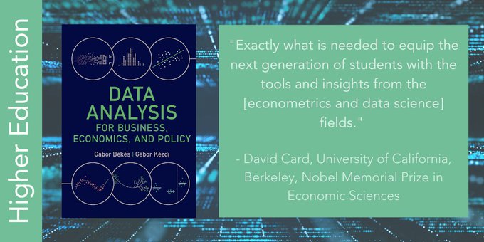
Data Analysis is a mix of statistics, econometrics, data science, machine learning with the aim of teaching practical skills that analysts may use in real life working in business. As instructor of Data Analysis and program director at CEU MS in Business Analytics for years, I have experimented quite a bit with the curriculum. The experience gave rise to a textbook co-authored with Gabor Kezdi and published by Cambridge University Press. It is currently used in 80+ programs around the world, including a dozen Analytics Master’s programs.
How can this Data Analysis for Business, Economics, and Policy textbook help instructors and students Business Analytics or related programs? We believe it can help in several different aspects.
We think there are four key benefits of using the textbook in Business Analytics education: an approach that aims at highlighting the analytical process, curated content from exploration to machine learning and causal inference, focus on case studies and an ecosystem helping the learning process.
First, it will help students understand that Data analysis is a process. It starts with formulating a question and collecting appropriate data or assessing whether the available data can help answer the question. Then come the tedious but essential tasks of data cleaning and organizing that affect the results of the analysis as much as any other step in the process. Exploratory data analysis gives context to the eventual results and helps deciding the details of the analytical method to be applied. The main analysis consists of choosing and implementing the method to answer the question, with potential robustness checks. Along the way, correct interpretation and effective presentation of the results are crucial. Carefully crafted data visualizations help summarize our findings and convey the key messages. The final task is to answer the original question, with potential qualifications and directions for future inquiries.
Second, it will help you think about a course structure. In our view, a great way to teach the whole process is to organize it in four courses: data exploration, regression analysis, prediction with machine learning, and causal analysis.
Data Exploration: The first course starts with discussing (and possibly doing) data collection and thinking about data quality, followed by organizing and cleaning data, exploratory data analysis and data visualization. This first part must also include the key statistical knowledge needed for everything else: important distributions, statistical inference, correlation and hypothesis testing and some sampling methods. You may offer this as a bootcamp or a pre-session allowing more experienced students to exam out.
Regression analysis Thorough introduction to regression analysis comes next, including probability models and time series regressions. It is vital for data analysis students to learn designing regression models and deeply understand their output. As part of the process, they may learn the role of selecting a functional form, dealing with uncertainty as well as different types of dependent variables.
Prediction with Machine Learning: The third part covers predictive analytics and introduces cross-validation, LASSO, tree-based machine learning methods such as random forest, probability prediction, classification, and forecasting from time series data. This is where modern data science is presented in a prediction context focusing on the “do what works” approach. In this course, only a few methods are presented, but those are discussed in depth. Students may then take additional machine learning classes to master other models like deep learning.
Causal effect of interventions: The fourth part covers causal analysis, starting with the potential outcomes framework as well as DAGs (causal maps). Students discuss the role of randomized experiments as well as practical issues doing them offline and online. Statistical methods include difference-in-differences analysis, various panel data methods and the event study approach.
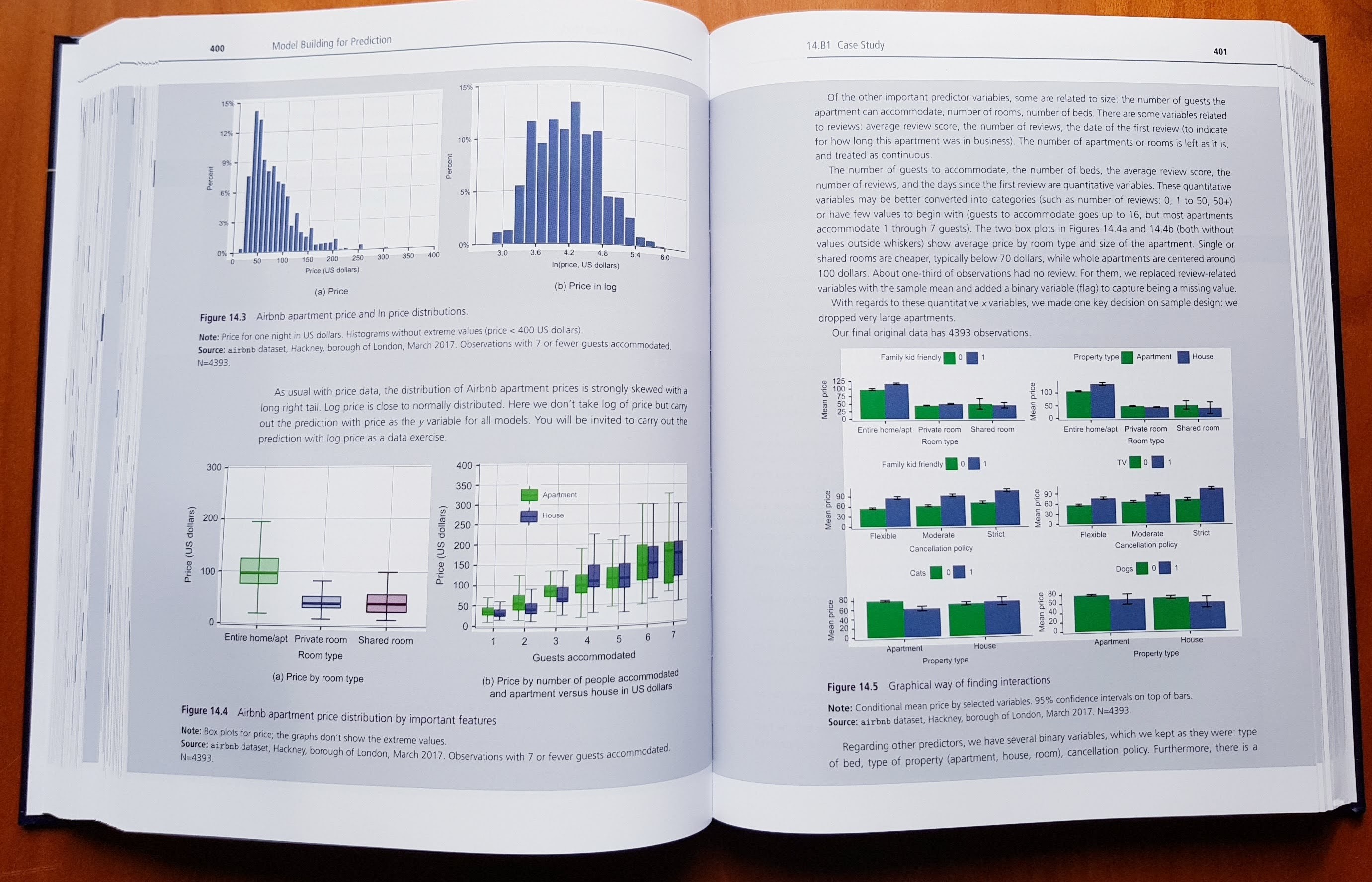
Third, our approach focuses on explaining how to carry out an actual data analysis project from beginning to end. To cover all the steps that are necessary to carry out an actual data analysis project, we lean on a set of fully developed case studies. While each case study focuses on the method discussed in the chapter, they illustrate all elements of the process from question through analysis to conclusion. Our case studies cover a wide range of topics, with a potential appeal to a wide range of students. They include consumer decision, economic and social policy, finance, business and management, health, and sport. Their regional coverage is also wider than usual: one third is from the U.S.A., one third is from Europe and the U.K., and one third is from other countries or includes all parts of the world, from Australia to Thailand.
Fourth, there is an ecosystem built into and around the textbook, consisting of
In summary, analytic process orientation, comprehensive coverage of key topics, a focus on cases studies and a massive ecosystem (with data, code and even a coding course) makes this package a great value for instructors and students in Business analytics or applied data science programs.
The book is endorsed by two Nobel laureates (Angrist and Card), the dean of Yale School of Management (Charles) and many leading scholars. It is already adopted in over 80 courses globally, including Columbia, U Texas, U Michgan, Penn State, Pittsburgh, U of California, Simon Fraser, UCLondon, Cambridge Judge, Essex, ESSEC, Bocconi, Berlin, CEU Vienna, Budapest, Amsterdam, UC Dublin, UWA Perth, Kyoto.
You may buy the book: Amazon.com, or a great deal of global options
Request an examination copy from the Publisher (or DM me)
Contact us
Follow us on Twitter and Facebook
As noted earlier, data analysis is a process. Hopefully we can help you enjoy the journey.
]]>Precise interpretation of a simple univariate, cross-sectional regression is not easy.
There are many good (precise) ways to do it, some that are not perfect and some that are not good. So let us offer an example, and a vareity of good, partially ok, but problematic and simply wrong answers. We also add some comments to explain why an asnwer is good or bad.
You have a representative sample of 10,000 people in a country, aged 15-45. You are interested in the relationship between earning (USD /per year) and age. You run a simple linear regression estimated with OLS. Both \(y\) and \(x\) are in levels.
\[y^{E} = \hat\alpha + \hat \beta \times age\]The estimated coefficients are: \(\hat \alpha = 7000, \hat\beta = 400\). The task is to interpret both of these coefficients.
Let us start with the constant (intercept) \(\hat\alpha\)
Now let us look at the slope, \(\hat\beta\)
For constant, \(\hat\alpha\)
For slope, \(\hat\beta\)
For constant, \(\hat\alpha\)
For slope, \(\hat\beta\)
We introduced some new notation in the textbook, to make the formulae simpler and more focused. In particular, our formula for regressions is slightly different from the traditional formula. We think that it is good practice to write out the formula for each regression that is analyzed. For this reason, it important to use a notation for the regression formula that is as simple as possible and focuses only on what we care about. Our notation is intuitive, but it’s slightly different from traditional practice. Let us explain our reasons.
Our approach starts with the definition of the regression: it is a model for the conditional mean. The formulaic definition of the simple linear regression is \(E[y \mid x]= \alpha + \beta x\) .
The formulaic definition of a linear regression with three right-hand-side variables is
\[E[y \mid x_1, x_2, x_3]= \beta_0 + \beta_1 x_1 + \beta_2 x_2 + \beta_3 x_3\]The regression formula we use in the textbook is a simplified version of this formulaic definition. In particular, we have \(y^E\) on the left-hand side instead of \(E[y \mid ...]\). So \(y^E\) is just a shorthand for the expected value of \(y\) conditional on whatever is on the right-hand side of the regression.
Thus, the formula for the simple linear regression is \(y^E = \alpha + \beta x\), and \(y^E\) is the expected value of \(y\) conditional on \(x\). The formula for the linear regression with three right-hand-side variables is
\[y^E= \beta_0 + \beta_1 x_1 + \beta_2 x_2 + \beta_3 x_3\]and here \(y^E\) is the expected value of \(y\) conditional on \(x_1\), \(x_2\), and \(x_3\). Having \(y^E\) on the left-hand side makes notation much simpler than writing out the conditional expectation formula \(E[y \mid ...]\), especially when we have many right-hand-side variables.
In contrast, the traditional regression formula has the variable \(y\) itself on the left-hand side, and has an additional element, the error term. This different notation acknowledges the fact that the actual value of \(y\) is equal to its expected value (defined by the model) plus a deviation from it. For example, the traditional formula for the linear regression with three right-hand-side variables is
\[y= \beta_0 + \beta_1 x_1 + \beta_2 x_2 + \beta_3 x_3 + e\]Importantly, it does not imply, that the model is about the conditional mean.
Our notation is simpler, because it has fewer elements. More importantly, our notation makes it explicit that the regression is a model for the conditional mean. It focuses on the data that analysts care about (the right-hand-side variables and their coefficients), without adding anything else. Especially for introductory courses, we believe, it’s a better way.
Note that there are reasons to go beyond this notations. With causal analysis, we may come back to the traditional model and have a term capturing unobserved heterogeneity (often denoted by u not e.) For instance, when introducing potential outcomes, it may be useful. For prediction, we may also have a model with explicitly having a prediction error: the difference between actual and predicted value for a given \(y_i\).
But, well, for most uses of a regression model, we suggest building on the expected value as a starting point to push the idea of regression as a model of conditional mean, and using our shorthand to simplify notation.
]]>About two years ago, we had to make final decision about how the graphs in the textbook will loook like. I am an economist, and well, I know about ten colors. I have had no idea what a hue means. I did not really know what a color scheme was.
Then, two things happen. First TV shows about interior design with their discussion of color schemes. My fav show has been BBC’s The Great Interior Design Challenge. This is when I first learnt that what I color blueish green is actually teal. And that there sooo many different shades of a color. Heard about the idea of color palettes and schemes, too.
Second, we had a serious discussion with Gabor K - he is partially color blind (as are about 6% of population) on what he may and may not see. Red and green, not an option. So we needed to decide on how we use colors, and we were set to pick two good looking, color-blind friendly colors. To get started, I talked to my dataviz mentor, Alberto Cairo, who showed me a great application, called Color Oracle that will pinpoint if an image works for color blind folks.
Then, I visited my editors in Cambridge, and I also met technical people, who told me that there are no more 2 or 3-color books, it is either a single color or full color. So if we wanna have colors, we can have as many colors as we’d like. Awesome.
So the summary of all this is that we realized, we can have many colors, but not any colors. And we need a scheme. So we tried to pin down our needs:
I searched around untill I found a wonderful video on Viridis. This is a conference talk at SciPy2015 by Nathaniel Smith and Stéfan van der Walt. In less than 20 minutes, it explained how vision works, what could go wrong and why viridis is a solution. Viridis is a scheme first developed for Matplotlib in Python, but now available in R and Stata as well.
When we needes a set of pre-defined colors for scatterplots or line graphs we picked 5 colors from the scheme (here with their HEX code)
And, well, that is basically it. We then went on and had the textbook key colors be also based on Viridis. But that will be another post…
The viridis color palette in R by Bob Rudis, Noam Ross and Simon Garnier Matplotlib colormaps, Option “D”.
]]>How can we test if goalkeepers play mixed strategies? Well, we can test if they move randomly, and test randomness for a large set of goalkeepers.
Testing the hypothesis of random action across goalkeepers is what Ignacio Palacios-Huerta carried out in his wonderful book (Beautiful Game Theory: How Soccer Can Help Economics.
In the very first chapter, the author looked at penalties, from the point of view of randomness. Goalkeepers often decide to move before the ball is shot. Having collected data on where the goalkeeper moved, he tests if moves (such as left and up or right and down) are random. Random action is mixed strategy. For 40 keepers, two of them are found to have non-random system of moving at 5%. This is exactly the number of falsely accepted $H_{A}$, we would expect based on chance.
Thus, finding two keepers not seemingly follow random action does not indeed prove that the do not play mixed strategy. Instead it shows, that for multiple testing, we should need a tigher confidence interval, maybe 1% or 0.05%. With such a tight CI set for multiple testing, we could not reject random action for either goalkeeper.
One of Abraham Wald’s tasks was to figure out where to put armor on fighter airplanes. A dataset was put together on airplanes from previous combats with bullet holes shown on various parts of the planes. For example, wings were hit in x% of the cases, vertical stabilizers in y%, etc. The data showed a very low percentage for engines: hardly any of the airplanes had their engines hit by bullets.
Examining this data, Wald came to the conclusion that the extra armor should be fitted to protect engines. His superiors were stupefied: engines were in fact the least affected by bullets. But Wald’s argument convinced them in the end. What was that argument?
Wald realized that the data did not represent all fighter airplanes that fought combats. It included only airplanes that returned from combat so that their bodies could be examined for bullet holes. But the most important observations would have been those that did not return from combat: those were the airplanes that could have benefited the most from the extra armor.
The fact that the airplanes that returned had no bullet holes in their engines could have had two reasons: engines were not hit, or the airplanes whose engines were hit were missing from the data. As the engines were exposed to bullets and had large enough surface the first reason was unlikely. In contrast, the second reason was very likely: airplanes whose engines were hit were lost almost certainly, while many of the airplanes whose other parts were hit were able come back. Therefore, although they were not in the data, there were airplanes whose engines were hit, and they suffered the most. Putting armor on the engines had the potential to save the most airplanes.
The essence of the issue here was sample selection: the sample of airplanes that returned from combat was not a representative sample of all airplanes that participated in the combats. Instead it was affected by severe selection bias: only surviving planes made it to the sample.
This is a well known story, told in several places. Source of the image: McGeddon from Wikipedia
]]>Gaunt found that in a subset of parishes with good records, 3 burials took place on average per year for 11 families, and average family size was about 8. He used these estimates together with a already known sum: the total number of burials in London. The result of his estimation was a total population of 384,000. Of course, as Graunt himself recognized, the merits of this exercise rest on the quality of all ingredients in the calculation (burials per family, persons per family, total number of burials). In modern language, the first two are questions of representation: were those parishes that provided the estimates representative of all parishes? There was no way to answer that question with the data Graunt had, and the sampling method he had to use (parishes with good data) leaves room for severe selection bias.
The first publication of a sampling method that may be considered random was by Anders Kiaer, founder of Statistics Norway, in 1895. It described a data collection exercise using a sample that was selected using a complex and detailed rule, with a lot of stratification in the beginning but randomness in the end, to estimate statistics about the entire population. Most contemporary statisticians did not accept those estimates as they were not from the entire population. Kiaer also gave little detail on the random part of the selection; neither did he offer a systematic justification for why his method should work.
It took fifty years and many other statisticians, including Ronald A. Fisher and Jerzy Neyman, to develop a statistical theory that could be used to evaluate estimation from random samples. That theory convinced many statisticians that random samples may work after all, and many started to use relatively small random samples to estimate population statistics. The success of those examples, then, convinced users of statistics of the enormous value of random samples. Random samples proved to help learn orders of magnitude more about a population from the same budget than the previously used complete enumeration methods.
The initial distrust in random sampling is not that surprising. It is always better to have information on entire populations than samples. Perhaps one may think that we would need samples of a very large proportion, say, 50% or 20%, to get accurate estimates for the population – in which case the cost savings of sampling would not be that high. The fact that samples of a few thousand observations may give us a very good picture of entire populations is crucial for the practical value of random samples. It is also quite surprising.
There is something counterintuitive in the fact that it is the size of the sample that matters, not its proportion of the population. But it is true nevertheless. Leaving selection to a random rule may also run against our instincts. It amounts to giving up control over the process – and, as humans, we often think that we make better decisions when we are in control. In the end, it was the demonstrated success of random samples that showed our intuition wrong, and, together with the mathematical statistical theory, convinced most users of the merits of relatively small random samples.
One influential example was the 1936 poll conducted by the then popular magazine Literary Digest to predict whether the incumbent Democratic president Franklin D. Roosevelt or Alfred Landon, the Republican candidate, would win the presidential election. The Literary Digest asked 10 million people and received answers from over 2 million, by far the largest poll conducted to date. The poll predicted a landslide victory for Alfred Landon: 57% against Roosevelt’s 43%.
The actual results were 62% for Roosevelt versus 38% for Landon. The 2 million strong Literary Digest sample was not a random subsample of the entire electorate: the 10 million invitees were its own readers, augmented by a sample from the telephone directory (back then, only more affluent Americans had a telephone). Moreover, the 2 million that replied were not a random subsample of the 10 million.
At the same time, a substantially smaller but more representative sample conducted by a small company just started by George Gallup correctly predicted a victory for Roosevelt.
Peverille Squire: Why the 1936 literary digest poll failed, Public Opinion Quarterly, 1988, 52, 125:133. LINK
]]>Stratified sampling improves on the representative nature of a sample. It starts by specifying large groups in the population, and it applies random sampling within each group.
Cluster sampling starts by specifying small groups, takes a random sample from each of those groups, and collects data from all observations within each selected group. It can greatly reduce data collection cost, for example for in-person interviews that require a lot of traveling. In exchange, cluster samples increase the uncertainty in the data because the number of clusters is a lot smaller than the number of people, thus the sample size is smaller from the point of view of representation.
Multi-stage sampling mitigates this problem by selecting a somewhat larger number of clusters in a first stage and taking a random sample of observations within each cluster instead of including all observations. Some data collection requirements present specific circumstances that may call for further variations on random sampling.
One example for stratified sampling comes from the Comparing online and offline prices
case study. People collecting data received instructions to sample a specified number of products (between 10 and 50) in each store, in a stratified manner (by department). To what extent the resulting samples ended up representing the population is an open question here. However, if the purpose of the analysis of comparing online and offline prices, it is this difference that has to be similar in the sample and in the population of all products. As long as these distributions are similar, other differences are not that important.