Sections 10.11-10.12 - Causal Analysis & Prediction
Using multiple regression for causal analysis and prediction
When interpreting regression coefficients, we advise being careful with the language, talking about differences and associations not effects and causation. But, can we say anything regarding the extent to which our results may indicate a causal link?
This question is all the more relevant because one main reason to estimate multiple regressions is to get closer to a causal interpretation. By conditioning on other observable variables, we can get closer to comparing similar objects – “apples to apples” – even in observational data. But getting closer is not the same as getting there.
For example, estimating the effect of a training program at a firm on the performance of employees would require comparing participants to non-participants who would perform similarly without the program. A randomized experiment ensures such comparability. By randomly deciding who participates and who does not participate, we get two groups that are very similar in everything that is relevant, including what their future performance would be without the program. If, instead of a random rule, employees decided for themselves whether they participate in the program, a simple comparison of participants to non-participants would not measure the effect of the program because participants may have achieved different performance without the training.
The difference is between data from controlled experiments and observational data. Simple comparisons don’t uncover causal relations in observational data. In principle, we may improve this by conditioning on every potential confounder: variables that would affect \(y\) and the causal variable \(x_1\) at the same time. (In the training example, these are variables that would make participants and non-participants achieve different performance without the training, such as skills and motivation.) Such a comparison is called ceteris paribus.
But, importantly, conditioning on everything is impossible in general. Ceteris paribus prescribes what we want to condition on; a multiple regression can condition on what’s in the data the way it is measured.
One more caveat. Not all variables should be included as covariates even if correlated both with the causal variable and the dependent variable. Such variables are called bad conditioning variables, or bad control variables. Examples include variables that are actually part of the causal mechanism, for example, the number of people who actually see an ad when we want to see how an ad affects sales.
What variables to include in a multiple regression and what variables not to include when aiming to estimate the effect of \(x\) on \(y\) is a difficult question. Chapter 19 will discuss this question along with the more general question of whether and when conditioning on other variables can lead to a good estimate of the effect of \(x\) on \(y\), and what we mean by such an effect in the first place.
Prompt: “Explain the difference between a confounder and a bad control variable. Give an example of each in the context of estimating the effect of education on earnings.”
Getting closer to understanding causes of gender pay inequality
Figure 10.2b showed a large and relatively stable average gender difference in earnings between ages 40 and 60 in the data and the population it represents (employees with a graduate degree in the U.S.A. in 2014). What might cause that difference?
Concepts of Discrimination
One potential explanation is labor market discrimination. Labor market discrimination means that members of a group (women, minorities) earn systematically less per hour than members of another group (men, the majority) even if they have the same marginal product. Marginal product simply means their contribution to the sales of their employer by working one additional hour. If one hour of work by women brings as much for the employer as a one hour of work by men, they should earn the same, at least on average. There may be individual deviations for various reasons due to mistakes and special circumstances, but there should not be systematic differences in earnings per hour.
Note that this concept of labor market discrimination is quite narrow. For example, women may earn less on average because they are less frequently promoted to positions in which their work could have a higher effect on company sales. That would not count as labor market discrimination according to this narrow definition. A broader notion of discrimination would want to take that into account. An even broader concept of social inequality may recognize that women may choose occupations with flexible or shorter hours of work due to social norms about division of labor in the family. That may result in the over-representation of women in jobs that offer lower wages in return for more flexible hours.
Empirical Investigation
Let’s use our data to shed some light on these issues. Starting with the narrow definition of labor market discrimination, we have a clear steer as what ceteris paribus analysis would be: condition on marginal product, or everything that matters for marginal product (and may possibly differ by gender). These may include cognitive skills, motivation, the ability to work efficiently in teams, etc. Real life data does not include all those variables. Indeed, our data has very little on that: three broad categories of graduate degree and age. We may add race, ethnicity, and whether a person was born in the U.S.A. that may be related to the quality of education as well as other potential sources of discrimination, but those variables tend not to differ by gender so their inclusion makes little difference.
To shed light on broader concepts of discrimination, we may want to enrich our regression by including more covariates. One example is occupation. Women may choose occupations that offer shorter and more flexible hours in exchange for lower wages. Occupation would be a bad conditioning variable for uncovering labor market discrimination in the narrow sense. But conditioning on it may shed light on the role of broader social inequality in gender roles. Similar variables are industry, union status, hours worked, where people live, and their family circumstances.
# R Code to replicate Table 10.5
library(estimatr)
library(modelsummary)

# Load data - subset to ages 40-60
data <- read.csv("cps_earnings_grad.csv")
data_40_60 <- subset(data, age >= 40 & age <= 60)

# Model 1: Unconditional difference
model1 <- lm_robust(lnearnings ~ female, data = data_40_60)

# Model 2: + productivity variables (age, education, race)
model2 <- lm_robust(lnearnings ~ female + age + I(age^2) +
                     factor(grad_degree) + factor(race) + born_us,
                    data = data_40_60)

# Model 3: + all other covariates (occupation, industry, etc.)
model3 <- lm_robust(lnearnings ~ female + age + I(age^2) +
                     factor(grad_degree) + factor(race) + born_us +
                     factor(occupation) + factor(industry) +
                     factor(state) + married + hours_worked,
                    data = data_40_60)

# Model 4: + polynomial in age and hours
model4 <- lm_robust(lnearnings ~ female + poly(age, 4) + poly(hours_worked, 2) +
                     factor(grad_degree) + factor(race) + born_us +
                     factor(occupation) + factor(industry) +
                     factor(state) + married,
                    data = data_40_60)

# Display results (show only female coefficient)
modelsummary(list(model1, model2, model3, model4),
             stars = c('***' = 0.01, '**' = 0.05, '*' = 0.1),
             gof_omit = "IC|Log|F",
coef_omit = "^(?!female)")Table 10.5 shows results of those regressions. Occupation, industry, state of residence, and marital status are categorical variables. We entered each as a series of binary variables leaving one out as a reference category. Some regressions have many explanatory variables. Instead of showing the coefficients of all, we show the coefficient and standard error of the variable of focus: \(female\). The subsequent rows of the table indicate which variables are included as covariates. This is in fact a standard way of presenting results of large multiple regressions that focus on a single coefficient.
The data used for these regressions in Table 10.5 is a subset of the data used previously: it contains employees of age 40 to 60 with a graduate degree who work 20 hours per week or more. We have 9,816 such employees in our data.
Table 10.5: Gender differences in earnings – regression with many covariates on a narrower sample
| Variable | (1) | (2) | (3) | (4) |
|---|---|---|---|---|
| female | -0.224*** | -0.212*** | -0.151*** | -0.141*** |
| (0.010) | (0.010) | (0.011) | (0.011) | |
| Controls: | ||||
| Age (linear or polynomial) | ✓ | ✓ | ✓ (4th order) | |
| Education (3 categories) | ✓ | ✓ | ✓ | |
| Race, ethnicity, born in USA | ✓ | ✓ | ✓ | |
| Occupation (22 categories) | ✓ | ✓ | ||
| Industry (13 categories) | ✓ | ✓ | ||
| State (50 states) | ✓ | ✓ | ||
| Married | ✓ | ✓ | ||
| Hours worked | ✓ | ✓ (quadratic) | ||
| Observations | 9,816 | 9,816 | 9,816 | 9,816 |
| R-squared | 0.048 | 0.065 | 0.195 | 0.202 |
Note: Robust standard error estimates in parentheses. *** p<0.01, ** p<0.05, * p<0.1
Source: cps-earnings data. U.S.A., 2014. Employees with a graduate degree. Employees of age 40 to 60 who work 20 hours per week or more.
Interpretation
Column (1) shows that women earn 22.4% less than men, on average, in the data (employees of age 40 to 60 with a graduate degree who work 20 hours or more, U.S.A. CPS 2014). When we condition on the few variables that may measure marginal product, the difference is only slightly less, 21.2% (column (2)). Does that mean that labor market discrimination, in a narrow sense, plays no role? No, because we did not condition on marginal product or all variables that may affect it. Omitted variables include details of degree, quality of education, measures of motivation etc. So differences in marginal product may play a stronger role than the minuscule difference uncovered here.
Column (3) includes all other covariates. The gender difference is 15.1%. When we compare people with the same family characteristics and job features as measured in the data, women earn 15.1% less than men. Some of these variables are meant to measure job flexibility, but they are imperfect. Omitted variables include flexibility of hours, commuting time, etc. Column (4) includes the same variables but pays attention to the potentially nonlinear relations with the two continuous variables, age and hours worked. The gender difference is very similar, 14.1%. The confidence intervals are reasonably narrow around these coefficients (\(\pm 2\%\)). They suggest that the average gender differences in the data, unconditional or conditional on the covariates, is of similar magnitude in the population represented by our data to what’s in the data.
See what happens as you add more variables with our interactive dashboard. Adjust variables and watch the regression change in real-time.
What We Learned
What did we learn from this exercise? We certainly could not safely pin down the role of labor market discrimination versus differences in productivity in gender inequality in pay. Even their relative role is hard to assess from these results as the productivity measures (broad categories of degree) are few, and the other covariates may be related to discrimination as well as preferences or other aspects of productivity (age, hours worked, occupation, industry). Thus, we cannot say that the 14.1% in Column (4) is due to discrimination, and we can’t even say if the role of discrimination is larger or smaller than that.
Nevertheless, our analysis provided some useful facts. The most important of them is that the gender difference is quite small below age 30, and it’s the largest among employees between ages 40 and 60. Thus, gender differences, whether due to discrimination or productivity differences, tend to be small among younger employees. In contrast, the disadvantages of women are large among middle-aged employees who also tend to be the highest earning employees. This is consistent with many potential explanations, such as the difficulty of women to advance their careers relative to men due to “glass ceiling effects” (discrimination at promotion to high job ranks), or differences preferences for job flexibility versus career advancement, which, in turn, may be due to differences in preferences or differences in the constraints the division of labor in families put on women versus men.
On the methods side, this case study illustrated how to estimate multiple linear regressions, and how to interpret and generalize their results. It showed how we can estimate and visualize different patterns of association, including nonlinear patterns, between different groups. It highlighted the difficulty of drawing causal conclusions from regression estimates using cross-sectional data. Nevertheless, it also illustrated that, even in the absence of clear causal conclusions, multiple regression analysis can advance our understanding of the sources of a difference uncovered by a simple regression.
Prompt: “Looking at Table 10.5, explain why we can’t conclude that the 14.1% gender wage gap in column (4) is entirely due to discrimination. What are at least three alternative explanations?”
One frequent reason to estimate a multiple regression is to make a prediction: find the best guess for the dependent variable, or target variable \(y_j\) for a particular target observation \(j\), for which we know the right-hand side variables \(x\) but not \(y\). Multiple regression offers a better prediction than a simple regression because it includes more \(x\) variables.
The predicted value of the dependent variable in a multiple regression for an observation \(j\) with known values for the explanatory variables \(x_{1j}, x_{2j}, ...\) is simply
\[ \hat{y}_j = \hat{\beta}_0 + \hat{\beta}_1 x_{1j} + \hat{\beta}_2 x_{2j} + ... \]
When the goal is prediction, we want the regression to produce as good a fit as possible. More precisely, we want as good a fit as possible to the general pattern that is representative of the target observation \(j\). Good fit in a dataset is a good starting point – that is, of course, if our data is representative of that general pattern. But it’s not necessarily the same. A regression with a very good fit in our dataset may not produce a similarly good fit in the general pattern. A common danger is overfitting the data: finding patterns in the data that are not true in the general pattern. Thus, when using multiple regression for prediction, we want a regression that provides good fit without overfitting the data. Finding a multiple regression means selecting right-hand-side variables and functional forms for those variables. We’ll discuss this issue in more detail when we introduce the framework for prediction in Chapter 13.
But how can we assess the fit of multiple regressions? Just like with simple regressions, the most commonly used measure is the R-squared. The R-squared in a multiple regression is conceptually the same as in a simple regression that we introduced in Chapter 7:
\[ R^2 = \frac{Var[\hat{y}]}{Var[y]}=1-\frac{Var[e]}{Var[y]} \]
where \(Var[y]=\frac{1}{n}\sum_{i=1}^{n}(y_{i}-\bar{y})^{2}\), \(Var[\hat{y}]=\frac{1}{n}\sum_{i=1}^{n}(\hat{y}_{i}-\bar{y})^{2}\), and \(Var[e]=\sum_{i=1}^{n}(e_{i})^2\). Note that \(\bar{\hat{y}}=\bar{y}\), and \(\bar{e}=0\).
The R-squared is a useful statistic to describe the fit of regressions. For that reason, it is common practice to report the R-squared in standard tables of regression results.
Unfortunately, the R-squared is an imperfect measure for selecting the best multiple regression. The reason is that regressions with the highest R-squared tend to overfit the data. When we compare two regressions, and one of them includes all the right-hand-side variables in the other one plus some more, the regression with more variables always produces a higher R-squared. Thus, regressions with more right-hand-side variables tend to produce higher R-squared. But that’s not always good: regressions with more variables have a larger risk of overfitting the data. To see this, consider an extreme example. A regression with a binary indicator variable for each of the observations in the data (minus one for the reference category) produces a perfect fit with an R-squared of one. But such a regression would be completely useless to predict values outside the dataset. Thus, for variable selection, alternative measures are used, as we shall discuss it in Chapter 14.
Until we learn about more systematic methods to select the right-hand-side variables in the regression for prediction, all we can do is to use our intuition. The goal is to have a regression that captures patterns that are likely to be true for the general pattern for our target observations. Often, that means including variables that capture substantial differences in \(y\), and not including variables whose coefficients imply tiny differences. That includes variables that capture detailed categories of a qualitative variables or complicated interactions. But to do really well, we will need the systematic tools we’ll cover in Chapters 13 and 14.
The last topic in prediction is how we can visualize the fit of our regression. The purpose of such a graph is to compare values of \(y\) to the regression line. We visualized the fit of a simple regression with a scatterplot and the regression line in the \(x-y\) coordinate system. We did something similar with the age–gender interaction, too. However, with a multiple regression with more variables, we can’t produce such a visualization because we have too many right-hand-side variables.
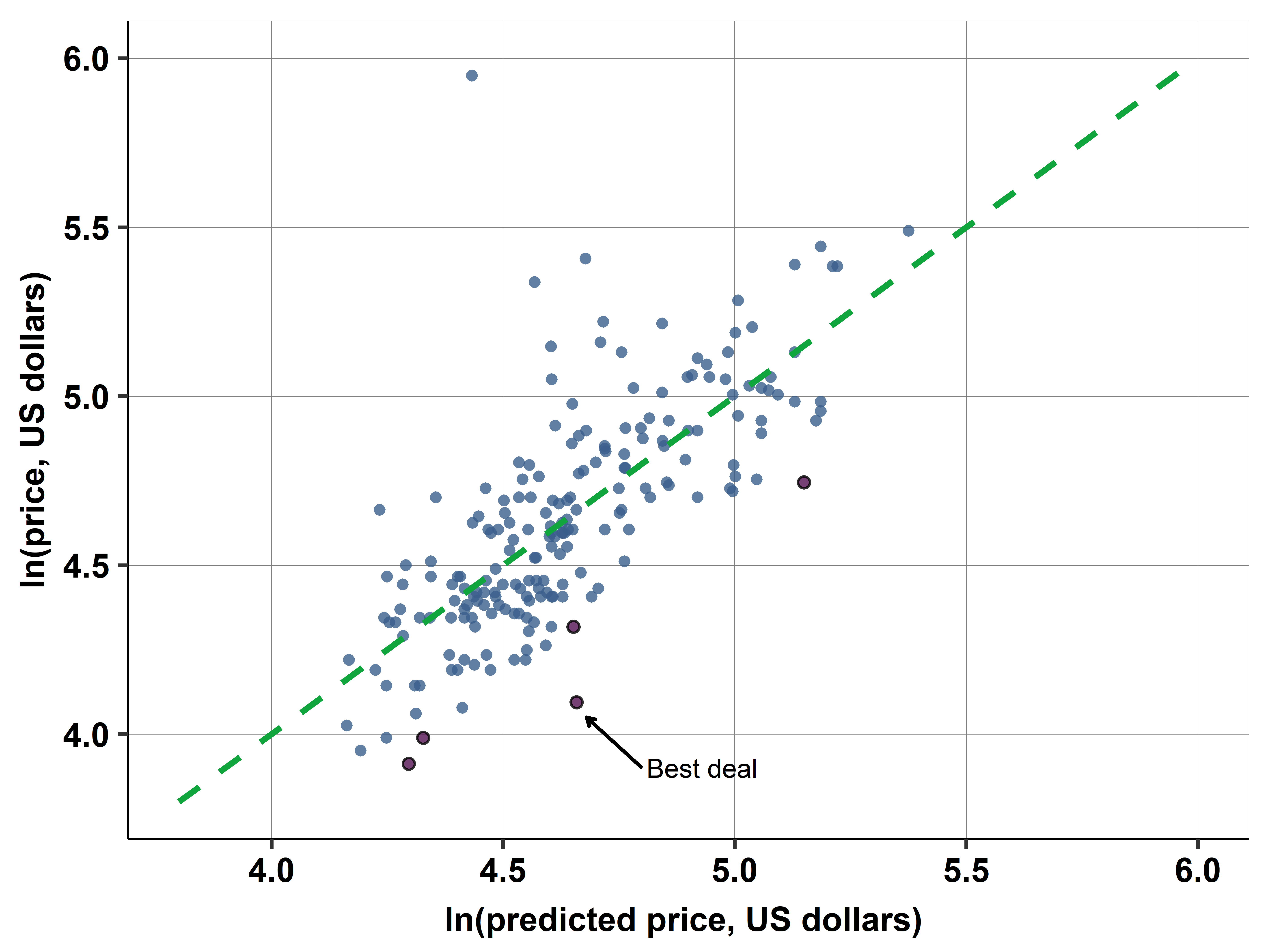
Instead, we can visualize the fit of a multiple regression by the \(\hat{y} - y\) plot. This plot has \(\hat{y}\) on the horizontal axis and \(y\) on the vertical axis. The plot features the 45 degree line and the scatterplot around it. The 45 degree line is also the regression line of \(y\) regressed on \(\hat{y}\). To see this consider that the regression of \(y\) on \(\hat{y}\) shows the expected value of \(y\) for values of \(\hat{y}\). But \(\hat{y}\) is already the expected value of \(y\) conditional on the right-hand-side variables, so the expected value of \(y\) conditional on \(\hat{y}\) is the same as \(\hat{y}\). Therefore this line connects points where \(\hat{y}=y\), so it is the 45 degree line.
The scatterplot around this line shows how actual values of \(y\) differ from their predicted value \(\hat{y}\). The better the fit of the regression, the closer this scatterplot is to the 45 degree line (and the closer R-squared is to one). But this visualization is more informative than the R-squared. For example, we can use the \(\hat{y} - y\) plot to identify observations with especially large positive or negative residuals. In this sense, it generalizes the scatterplot with a regression line when we only had a single \(x\).
Predicted value:
\[ \hat{y} = \hat{\beta}_0 + \hat{\beta}_1 x_1 + \hat{\beta}_2 x_2 + ... \]
Assessing fit: - R-squared: proportion of variance explained - Higher R-squared = better fit in sample - But: can overfit with too many variables
Visualizing fit: - \(\hat{y} - y\) plot: scatter plot with \(\hat{y}\) on x-axis, \(y\) on y-axis - 45-degree line: where \(\hat{y} = y\) (perfect predictions) - Points above line: underpredictions (\(\hat{y} < y\)) - Points below line: overpredictions (\(\hat{y} > y\))
Prompt: “Explain the problem of overfitting in multiple regression. Why is a model with R-squared = 0.95 not necessarily better than one with R-squared = 0.80 for prediction?”
Prediction with multiple regression
Let’s return once more to our example of hotel prices and distance to the city center. Recall that the goal of the analysis is to find a good deal – from among the hotels for the date contained in the data. A good deal is a hotel that is inexpensive relative to its characteristics. Of those characteristics two are especially important: the distance of the hotel to the city center and the quality of the hotel. In the earlier chapters we considered simple regressions with the distance to the city center as the only explanatory variable. Here we add measures of quality and consider a multiple regression. Those measures of quality are stars (3, 3.5 or 4) and rating (average customer rating, ranging from 2 to 5).
With prediction, capturing the functional form is often important. Based on earlier explorations of the price–distance relationship and similar explorations of the price–stars and price–ratings relationships, we arrived at the following specification. The regression has log price as the dependent variable, a piecewise linear spline in distance (knots at 1 and 4 miles), a piecewise linear spline in rating (one knot at 3.5), and binary indicators for stars (one for 3.5 stars, one for 4 stars; 3 stars is the reference category).
From a statistical point of view, this is prediction analysis. The goal is to find the best predicted (log) price that corresponds to distance, stars, and ratings of hotels. Then we focus on the difference of actual (log) price from its predicted value.
# R Code for hotel price prediction
library(estimatr)
library(lspline)

# Load data
hotels <- read.csv("hotels_vienna.csv")

# Create piecewise linear splines
hotels$dist_spline1 <- elspline(hotels$distance, c(1, 4))[,1]
hotels$dist_spline2 <- elspline(hotels$distance, c(1, 4))[,2]
hotels$dist_spline3 <- elspline(hotels$distance, c(1, 4))[,3]

hotels$rating_spline1 <- elspline(hotels$rating, 3.5)[,1]
hotels$rating_spline2 <- elspline(hotels$rating, 3.5)[,2]

# Create star dummies
hotels$stars_3.5 <- as.numeric(hotels$stars == 3.5)
hotels$stars_4 <- as.numeric(hotels$stars == 4)

# Estimate regression
model <- lm_robust(
  ln_price ~ dist_spline1 + dist_spline2 + dist_spline3 +
             rating_spline1 + rating_spline2 +
             stars_3.5 + stars_4,
  data = hotels
)

# Generate predictions
hotels$predicted_ln_price <- predict(model)
hotels$residual <- residuals(model)

# Find best deals (most negative residuals)
best_deals <- hotels[order(hotels$residual), ][1:5, ]

print(best_deals[, c("hotel_id", "price", "distance", "stars", "rating", "residual")])Good deals are hotels with large negative residuals from this regression. They have a (log) price that is below what’s expected given their distance, stars, and rating. The more negative the residual, the lower their log price, and thus their price, compared to what’s expected for them. Of course, our measures of quality are imperfect. The regression does not consider information on room size, view, details of location, or features that only photos can show. Therefore the result of this analysis should be a shortlist of hotels that the decision maker should look into in more detail.
Table 10.6: Good deals for hotels: the five hotels with the most negative residuals
| Hotel ID | Price (€) | Distance (miles) | Stars | Rating | Residual |
|---|---|---|---|---|---|
| 21912 | 85 | 1.2 | 3.5 | 4.2 | -0.42 |
| 18592 | 95 | 2.1 | 4.0 | 4.5 | -0.38 |
| 22080 | 78 | 1.8 | 3.0 | 3.8 | -0.35 |
| 19455 | 105 | 0.9 | 4.0 | 4.3 | -0.33 |
| 20118 | 88 | 1.5 | 3.5 | 4.0 | -0.31 |
Note: List of the five observations with the smallest (most negative) residuals from the multiple regression with log price on the left-hand-side; right-hand-side variables are distance to the city center (piecewise linear spline with knots at 1 and 4 miles), average customer rating (piecewise linear spline with knot at 3.5), binary variables for 3.5 stars and 4 stars (reference category is 3 stars).
Source: hotels data. Vienna, 2017 November, weekday. Hotels with 3 to 4 stars within 8 miles of the city center, n=217.
Table 10.6 shows the five best deals: these are the hotels with the five most negative residuals. We may compare this list with the list in Chapter 7, Section 7.4, that was based on the residuals of a simple linear regression of hotel price on distance. Only two hotels “21912” and “22080” featured on both lists; hotel “21912” is the best deal now, there it was the second best deal. The rest of the hotels from Chapter 7 did not make it to the list here. When considering stars and rating, they do not appear to be such good deals anymore because their ratings and stars are low. Instead, we have three other hotels that have good measures of quality and are not very far yet they have relatively low price. This list is a good short list to find the best deal after looking into specific details and photos on the price comparison website.
How good is the fit of this regression? Its R-squared is 0.55: 55 percent in the variation in log price is explained by the regression. In comparison, a regression with log price and piecewise linear spline in distance would produce an R-squared of 0.37. Including stars and ratings improved the fit by 18 percentage points.
The \(\hat{y}-y\) plot in Figure 10.3 visualizes the fit of this regression. The plot features the 45 degree line. Dots above the line correspond to observations with a positive residual: hotels that have higher price than expected based on the right-hand-side variables. Dots below the line correspond to observations with a negative residual: hotels that have lower price than expected. The dots that are furthest down from the line are the candidates for a good deal.
This concludes the series of case studies using the hotels dataset to identify the hotels that are the best deals. We produced a short-list of hotels that are the least expensive relative to their distance to the city center and their quality, measured by average customer ratings and stars.
This case study built on the results of several previous case studies that we used to illustrate many of the important steps of data analysis. The final list was a result of a multiple linear regression that included piecewise linear splines in some of the variables to better approximate nonlinear patterns of association. In two previous case studies (in Chapters 7 and 8), we illustrated how we can use simple regression analysis to identify underpriced hotels relative to their distance to the center without other variables. In previous case studies using the same data with the same ultimate goal, we described how the data was collected and what that implies for its quality (in Chapter 1); we illustrated how to prepare the data for subsequent analysis (in Chapter 2); and we showed how to explore the data to understand potential problems and provide context for subsequent analysis (in Chapter 3).
Lessons from the Hotel Case Study
What worked: 1. Multiple regression better than simple regression (R² = 0.55 vs 0.37) 2. Functional form matters (splines capture nonlinear patterns) 3. Quality measures (stars, ratings) explain a lot of variation 4. Residual analysis identifies specific opportunities
What to remember: 1. Predicted value ≠ true value (R² = 0.55 means 45% unexplained) 2. Unmeasured features matter (room size, view, amenities) 3. Use predictions as screening tool, not final decision 4. Always inspect shortlist manually
Prediction vs. understanding: - Here, we don’t care about causal effects - We only want accurate predictions - So functional form and fit are paramount - Interpretation of coefficients less important
Prompt: “In the hotel case study, we use a \(\hat{y}-y\) plot to identify good deals. Explain how this plot works and why hotels far below the 45-degree line are good deals. What are the limitations of this approach?”
We’ve now covered all of Chapter 10 on Multiple Linear Regression!
Across case studies A1-A6, we learned: - Unconditional gap: ~19.5% - Conditional on age: ~18.5% - Conditional on education: ~18.2% - Gap grows with age (10% → 22% from age 25 to 50) - Controlling for occupation, industry, etc.: ~14% - Cannot isolate pure discrimination from this analysis
From case study B1: - Multiple regression (R² = 0.55) better than simple (R² = 0.37) - Stars and ratings explain significant price variation - Identified 5 underpriced hotels - Residual analysis practical for finding deals
Chapter 11: Modeling probabilities (logit, probit)
Chapter 12: Time series regression
Chapter 13: Prediction framework
Chapter 19: Causal inference framework
🔗 Final Resources
All Case Studies Code: - Gender earnings analysis - Hotel prices analysis
Interactive Dashboards: - Multiple regression visualizations
All Data: - OSF Repository